In any data exercise, it is as important to know ‘what you don’t know’ as ‘building on what you know’. In the case of any Covid assessment, what we don’t know is what is the degree of sampling bias in the data coming out. Since not all countries are (and can) test at high capacities, it is inherently inconsistent to assume the lack of sampling bias. Most countries have been resorting to symptomatic tests till now and the number of tests vs number of people tested could also be different.
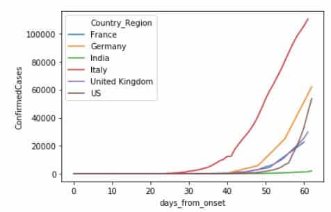
So, when you look at a plot like this, be aware that this is only one side of the coin. And that coin is in the air, flipping.

Fig. 1 – The exponentially increasing confirmed cases tell an incomplete story.
Having said that , while the data collection on total testing is limited, it is imperative to show how this data can be used. Early and assumption-prone data assessment is often a catalyst for rigorous data collection. In those terms, this is a call to arms for collection of testing numbers.
For this first assessment, we have referred to Our World in Data which has provided this data on their website.
Disclaimer – There is limited data available and the data collection isn’t consistent so the first version of this would not be reliable.
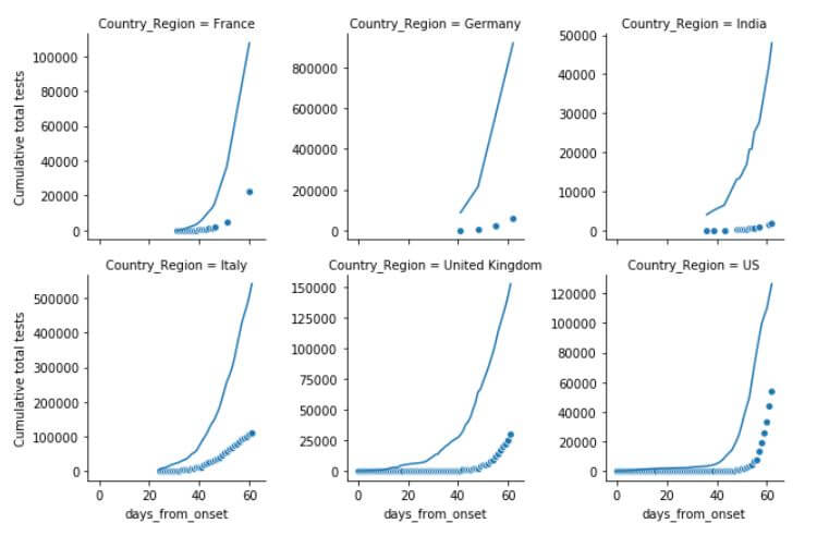
However, we hope to understand better granular and more rigorous data from various sources to improve upon this. Figure below shows how the number of tests performed has soared across countries (but not uniformly). The dots represent the confirmed cases. Does this change the perception from previous chart?

Fig. 2 – Dots represent the confirmed cases, lines represent the tests.
Any epidemiological conclusions would also need to understand what type of testing is being done, how many, with what sampling and how often? Are tests repeated for patients, or not?
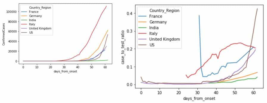
Having understood these limitation, it would still be insightful to see how the ratio of confirmed cases to total tested cases changes our perception of actions in the countries.

Fig 3 – The right side plot shows ratio of confirmed to total tested.
What does a lower ratio of confirmed to test imply? Is the downward slope of this line implication of reducing spread (if each test represents only one person only one time) or recovery (if multiple tests are conducted on the population in isolation)? Does a sharp up-trend mean we have started testing the clusters?
All such questions can be answered with better quality number of tests data.
Thanks to @astridwalle for sharing and curating the first version of testing dataset.

