
With the outbreak of Covid-19 pandemic, governments needed to take severe measures to contain the disease. For instance, many introduced health policies and contact tracing, as well as lockdown rules such as limiting travels, closing schools and workplaces. To understand better how governments reacted to the pandemic, we analyse the policies as a series of actions and detect clusters of Covid-19 lockdown measures common to many countries. This would allow understand the similarity of reactions and give indications on how to measure the impact on containing the disease.
In this blog, we present our effort on trying to find similar lockdown measures over time across different countries. Then we present dashboards allowing users to explore and get information on the result of our analysis.
Data
Data is referred as the stringency index that is provided by the Oxford COVID-19 Government Response Tracker (OxCGRT) [1, 2]. Stringency index contains the information on several different common policy responses that governments have taken to respond to the Covid-19 pandemic on 18 indicators such as school closures and travel restrictions. This index shows how intense the lockdown policies are.
To start with, we use the following 13 time-series indicator variables published in stringency index to find commonly occurring variable states. Each indicator variable contains an integer value between 0 and 4, depending on the strictness of the policy, where 0 means no measurement applied and 4 means the maximum level of enforcement was applied.
- School Closing
- Workplace Closing
- Public Events
- Gatherings Restrictions
- Close Public Transport
- Stay At Home
- Internal Movement Restrictions
- International Travel Controls
- Income Support
- Debt Relief
- Public Information
- Testing Policy
- Contact Tracing
Symbolisation of indicator variables
By mapping each indicator variable onto each axis in 13-dimensional hyperspace, we applied K-means clustering (K=4) where the centroids are shown in Figure 1. The centroids denote the commonly co-occurring indicator variable values that can be interpreted as representative values. We will call these centroids as stringency states. The purpose of applying K-means clustering is to improve the interpretability of data by reducing the dimensionality and expressing these stringency states as symbols to track the dynamics of the policy change of a country in a given time range. This is equivalent to a bag-of-words approach. Although it can be seen that stringency state D show the lowest level of strictness, it is important to note that they do not necessarily mean the overall strength of measurements as each government may have a different focus on each measurement policy. For example, clusters A and B both show a high level of strictness in international travel controls and public gatherings, but cluster C shows only international travel controls are enforced.
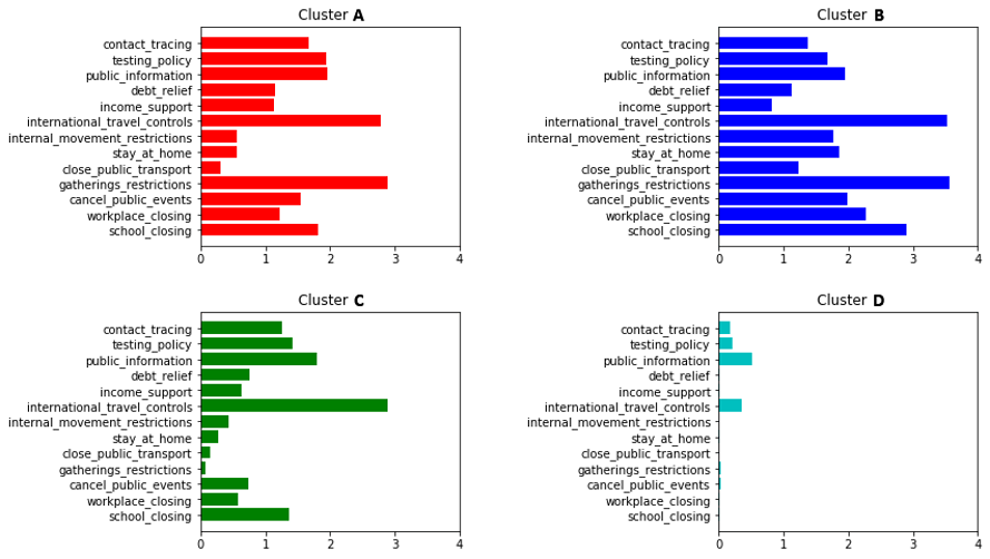
Figure 1. Representative cluster centroids (K=4) with commonly occurring indicator variable values
Time-series representation of stringency states
By mapping each stringency state to a symbol, e.g. A, B, C, or D, we can now represent a country’s history of lockdown measures in time as a sequence of symbols. Some examples are shown in Figure 2. Note that the colour represents as defined in Figure 1. It is expected that all countries start with cluster D (cyan), which has almost no measurement.
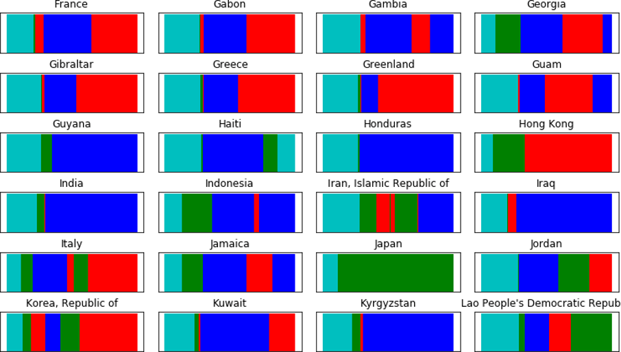
Figure 2. Time-series representation of the change in stringency states, colour-coded for visualisation.
Representation of policy dynamics
Now we can count how many times a stringency state made a transition into another state between two consecutive days and normalise the counts to compute the transition probability of stringency states. This was implemented by computing an n-grams table (n=2) and normalising such that the sum equals 1.
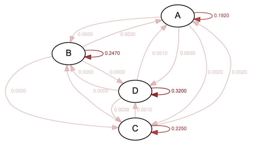
Figure 3. Example stringency state transition probability of Switzerland.
To compare the different dynamics of stringency states between countries, we represent the above transition probabilities as a histogram, as shown in Figure 4. We will call these transition histogram vectors.
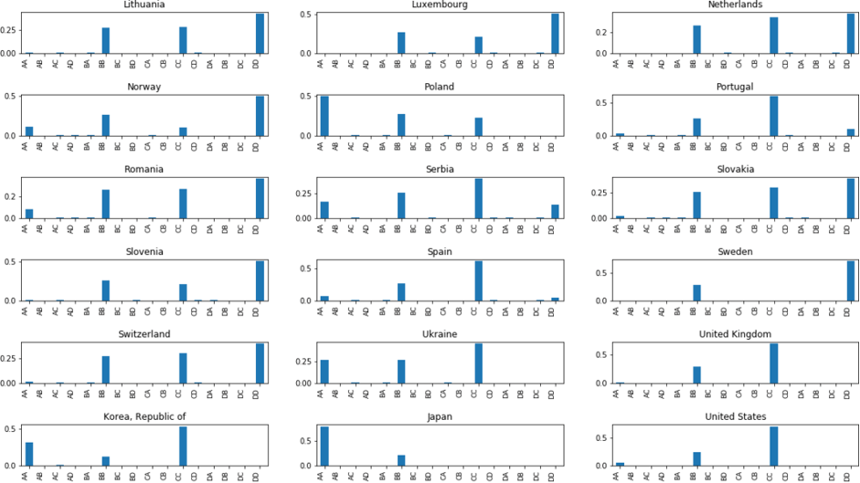
Some examples of stringency state transition probabilities.
Clusters of countries using transition histogram vectors
By using transition histogram vectors, we can find countries that have applied similar dynamics of measurements.
We performed a hierarchical agglomerative clustering at the country level to group similar countries at different levels of similarity. Hierarchical clustering is a method that looks for an existing hierarchy of clusters in data [3]. This method can take a dissimilarity matrix of data pairs as input and identify clusters using a linkage method which measures the distance between clusters.
The resulting clusters are shown as a dendrogram – a tree diagram with U-shaped lines – showing how clusters merge or split into other clusters. In Figure 5, we can see that the dendrogram of countries is consistent by comparison of the heights of each dendrogram link with the heights of neighbouring links below it in a specific level of hierarchy [4]. The closer the heights are below a cluster, the smaller is the distance between its members, implying high intra-cluster consistency.
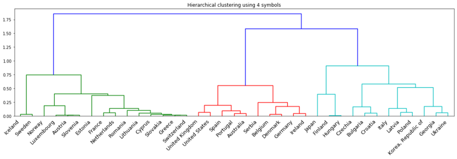
Figure 5. Distance computed between countries
We believe the process of clustering countries can provide valuable insight into the analysis of lockdown measures of different countries.
Dashboards
A dashboard is built to visualize information on the severity of lockdown measures and the clustering results.
The first tab of the dashboard shows the value of Stringency Index (0-100) by colour per country and for a chosen date. In a second tab, we allow the user to filter on lockdown measures and government policies to see the stringency index for the chosen measures. For example, in Figure 6 we can see in July 2020 the stringency index of most countries in South America were very high while in Europe we had a relatively low index.
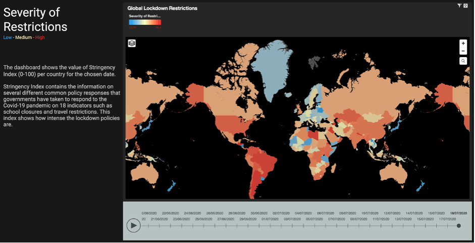
Figure 6. Stringency index dashboard
The clustering dashboard shows the result of both clustering approaches. Figure 7 shows the dashboard interface.
On the top, the clusters of countries (mainly in Europe), derived from the hierarchical clustering, are shown by colour. We can filter by the cluster number and see similar countries within a cluster. Besides, we can filter by the country name and visualize the countries that are similar to the chosen country.
In the bottom, the cluster states are shown derived from the k-means clustering. Cluster states are labelled by number and colour and show the co-occurring stringency measures common to many countries. The last plot shows the evolution of cluster states over time which indicates the transition of countries to the more or less severe set of lockdown measures.
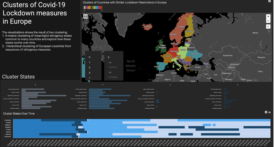
Figure 7. Clustering dashboard
Main takeaway
In this blog, we presented an analysis of government policies and lockdown measures through clustering methods to find similarities of behaviour. We also built dashboards to inform policymakers and public about the severity of stringency index, clusters of countries, and their common stringency states through time. Our work can be extended to find relations with the spread of Covid-19 and as a way to measure the impact of policies on containing the disease.
Disclaimer
This information can be used for educational and research use. The authors do not recommend generalizing the results and conclude decision-making on these sources alone.
The code is available on GitHub.
References
- Thomas Hale, Sam Webster, Anna Petherick, Toby Phillips, and Beatriz Kira. (2020). Oxford COVID-19 Government Response Tracker. Blavatnik School of Government. https://www.bsg.ox.ac.uk/research/research-projects/coronavirus-government-response-tracker. License: Creative Commons Attribution 4.0 International Public License.
- DELVE Global COVID-19 Dataset. (2020). https://github.com/rs-delve/covid19_datasets/blob/master/dataset/combined_dataset_latest.csv. License: Creative Commons Attribution 4.0 International Public License.
- Aggarwal, C. C. and Reddy, C. K. (2013). Data clustering: algorithms and applications. Chapman & Hall/CRC.
- Zahn, C. T. (1971). Graph-theoretical methods for detecting and describing gestalt clusters. IEEE Transactions on Computers, 100(1):68–86.
Authors
Kyuhwa Lee is a Senior Data Scientist at the IBM Data Science & AI Elite.
Mehrnoosh Vahdat is a Data Scientist with IBM Data Science & AI Elite team where she specializes in Data Science, Analytics platforms, and Machine Learning solutions.
Special thanks to Klaus Paul and Elaine Begley who helped in this work.
We are a team of data scientists from IBM’s Data Science & AI Elite Team, IBM’s Cloud Pak Acceleration Team, and Rolls-Royce’s R² Data Labs working on Regional Risk-Pulse Index: forecasting and simulation within Emergent Alliance. Have a look at our challenge statement!